


Don't miss


Latest Designzzz
DIY/Crafts

3 Things You Should Always Do When Working on DIY Projects With Your Kids
Working on DIY projects is a great bonding activity you can do with your kids. This hobby can be fun for the whole family, allowing your kids to fully explore their creative potential, and...
Architecture
Audrey Smit is Transforming Mundane Buildings Into Floral Miracles
Audrey Smith enjoys seeing flowers everywhere around her, and she’ll help you see them too. The digital designer behind the viral project Paint the World is using the power of Photoshop to transform mundane...
Fashion
Kiana Bonollo is Using Her Sewing Skills to Recreate Iconic Celebrity Outfits
It usually takes a whole team of people to make some of the best celebrity red carpet looks, but Kiana Bonollo is trying to recreate them all on her own. The talented fashion designer...
Home Decor

5 Ways to Incorporate Mermaidcore Into Your Home
Mermaidcore is one of the leading home décor trends of 2023, and it will be going stronger than ever this summer. This trendy aesthetic is pretty easy to embrace, and this brief guide will...
Architecture
This Instagram Page is Celebrating Architecture That Looks Straight Out of Wes Anderson’s Films
Wes Anderson is one of the modern filmmakers with the most distinctive visual style, defined by symmetrical shots and intricately designed, pastel-colored buildings. The Instagram page Accidentally Wes Anderson is honoring the architecture from...
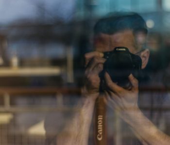
Photography

Best Ways to Embrace the Rule of Thirds in Different Types of Photos
The rule of thirds is one of the most popular composition guidelines, and it will help you take your photography skills to the next level. This technique is all about positioning the most important...